This time next week, I will be on an eclipse trip under-standing the shadow with my family, and thinking about all of the people sharing that experience, and the profound and powerful human eclipse experience throughout history. I thought I’d write a little about it.
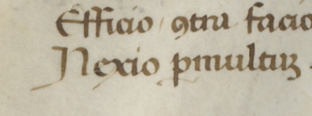
I don’t think I’ve looked at a manuscript that had eclipse-related illustrations, but I was able to search and find one, with the help of the British Library. This is from BL Burney MS 169, folio 69r, and it shows Alexander of Macedonia consulting astrologers after the battle of Arbela while his army gazes up in awe.

I wrote some stuff about this illustration assuming it depicted a solar eclipse somewhat oddly, before I noticed that the British Library blog article specifies it’s a lunar eclipse. Whoops. So instead I will write: I love this picture of soldiers witnessing an astronomical event together, and I especially love the radiating curves around the moon.
Eclipses in chronicles and art are important because they allow scholars to, among other things, align humanity’s various calendar systems to a precise reference point.
You can read more about eclipses in pre-modern records at these links, in increasing order of length and complexity:
- Total Eclipse of the Sun at the British Library blog
- Astronomers use Byzantine chronicles to learn about the Earth’s rotation at Medievalists.net
- Analyses for graphical records for a total solar eclipse in May 1230: a possible reference for the “Medieval Grand Maximum”, open access at ResearchGate
There are medieval manuscripts with astronomical diagrams of eclipses in them, and verbal descriptions, but other than the above, I didn’t have a lot of luck finding manuscript illustrations of people witnessing eclipses.

So, let me try again with a solar eclipse: this is a detail of “Dionysius the Areopagite Converting the Pagan Philosophers” by Antoine Caron (previously exhibited as “Astronomers studying an eclipse”). It was painted in the 1570s, and thus would have been informed by experiences and descriptions of a solar eclipse in 1571. However, this doesn’t look like a painting of eclipse totality to me– and indeed, EclipseWise suggests the totality path only barely touched Gibraltar.
For a complete discussion of the details of the painting, including an analysis of what kind of solar phenomenon it might show, read this 5-page article helpfully archived by NASA and Harvard. Spoiler: the authors don’t think it’s an accurate depiction of any kind of eclipse. Perhaps more interestingly, they go on to list a variety of interesting astronomical phenomena that could have inspired it.

Here’s one more eclipse from art history, which does appear to depict totality! Specifically, as the moon comes into perfect alignment with the sun, the sliver of sunlight around the edge squeezes down smaller and smaller, until the sunlight seems to form a thin circle with a single splash of bright light for a moment. That moment is called the diamond ring.
You can read more about the painting at this “Eclipses in art” web exhibit.
The early eighteenth century was an exciting time for eclipses in Europe, with total or annular eclipses crossing the region in 1706, 1708, 1715, and 1724. Cosmas Damian Asam painted his first work of Saint Benedict’s vision in 1726, but the one I’ve chosen here was painted in 1735. You can read more about Asam and St. Benedict in this 30-page paper.
The early eighteenth century was also a great time for eclipses because it’s when precise calculations of where eclipses could be seen became possible– and thus, it became possible to make sure to be in the right place. I had no idea that eclipse travel had such a long history! You can read more in this Smithsonian article on the history of eclipse chasing or this Atlas Obscura article about Edmond Halley’s eclipse maps. One of Halley’s goals in creating the maps was to make the phenomena less startling and confusing, and thus easier to appreciate as astronomical wonder. People who are tired of hearing about eclipses this year now know who to shake their fist at. I hope my readers who are in that population will forgive me this deviation from my usual 15th and 16th century manuscript material– I know I’m overdue for rambles about armor art, and I will try not to make you wait too much longer.


