Thanks to the variable time compression effects of this year, I wrote this in early November, thought I’d sleep on it and see if I still liked it, and… well, here we are.
Because apparently I have a research theme for 2020, I’d like to tell you about a variety of medieval depictions of a decorative gold thing that’s said to have been uncommon in practice, but I’ve seen it in lots of artwork from varied sources.
But I’m starting in the wrong place. Let me begin at the beginning.
Gauffering is a decorative technique used on the edges of books (the parts not covered by the binding) where the edges of the page block are gilded and then impressed with a repeating pattern. You can see some very nice 19th century examples with more explanation at these sites: University of Adelaide: Cover to Cover, Ron’s Art Blog, University of Liverpool Library: Manuscripts and More.
Sources disagree on how widespread or popular it was: U of Adelaide says “not common”, but the Language of Bindings Thesaurus says “not uncommon.” The Etherington and Roberts dictionary of bookbinding terms goes into more detail: “While this technique was used by a number of European bookbinders, it was especially associated with German bookbinding of the 16th century. The use of color on the edges of books bound in England was less frequent and more restrained. Plain gauffering was done well into the 17th century, usually on embroidered bindings, but appears to have declined sharply after 1650 or so.”
As always, the examples I’m about to show you are artwork– they aren’t photos, and the number or proportion of gauffered books in art has little relationship to the number that were actually made. These examples often place the books in the hands of saints, not ordinary people, and it seems likely the decoration is a symbol of wealth and preciousness. All I’m saying about commonality is all of these artists were aware of it as a way to make a book super fancy.
So. Pictures! First, a couple I saw and photographed in museums.


Mary’s gauffered book also has a chemise binding, which has a fabric wrapping built into the binding. It can protect the book from wear and handling or simply add additional tactile richness and specialness. The golden shadows in her book’s chemise may mean it’s made of shot silk, which is woven in a way that makes it change color in light and shadow.
Here’s a different Mary with a different book, from an altarpiece at the Metropolitan Museum of Art’s Cloisters galleries. The angel Gabriel is interrupting Mary in the middle of reading a chemise-bound book to give her some big news; beside her on a table is a gauffered book lying open by a small scroll, both on a green drawstring purse.

The thing that caught my eye here and inspired me to take a close-up photo is not actually the gauffering, but the way the pages seem to dance in a breeze or perhaps turn themselves. This is very common in medieval and early modern depictions of open books– you can see it in the Chicago Mary Magdalen’s book too.

According to my rare books professor, who seems trustworthy, this was something medieval and early modern books simply did. The combination of the binding methods of the time and the properties of parchment meant that pages didn’t lie docile waiting to be read, but might seem to turn themselves in response to the book being opened, or might need to be held still for reading.
I didn’t get a picture– this sort of thing is hard to capture with a camera and lens that took two hands to aim– but one of the Morgan Library books I looked at did this a little. Occasionally, a page would refuse to lie flat against its neighbor; I didn’t test whether any would turn themselves. Holding these pages in place is a major function of the little weighted velveteen book snakes the library provided for me.
Parchment can be generally kind of intractable. The gauffered book on the table in the painting has a little strip of binding material bridging across the fore-edge on the left side, which could indicate where the book’s last reader actually left off. But it’s not a bookmark; there are medieval bindings with bound-in ribbons or bookmarks with moving parts to record which page and column you left off on, so we know what a book with an attached bookmark would look like. I think this little strip indicates where the book was left open to (and the clasp naturally fell to, since its leather is too stiff to flop to the table) before the pages turned themselves to their current position.

That’s the strap from a book clasp, which holds the book shut when not in use. Book clasps are very common and in some collections even ubiquitous feature of medieval bindings. While it helps keep the book from flapping open during transport, they’re necessary for parchment books that never travel too. Parchment doesn’t lie flat without encouragement; this is sometimes poetically described as “longing to return to the shape it had when alive.” Book clasps affix the covers into a tidy, parallel slab shape and apply even pressure to the parchment, keeping it from taking ever more lively shapes. Erik Kwakkel’s piece “Hugging a medieval book” is a delightful examination of this practice if you want to know more.
I’m getting away from pictures again. Keep an eye out for more book clasps in these examples from around the internet.
I would have guessed that gauffering was done when a book was nearly finished, but these manuscript miniatures and painting show people writing content into unfinished books that already have decorated edges. It makes sense that gauffering might be done as part of the binding process, which could go before or after the content was put in. Also, it seems to hold up to handling better than I would have guessed (more on this later), so maybe there’s no detriment to doing it early.
Also, as you look at these, take note of the equipment of a scribe– the furniture, the accessories, the storage space, the scraps and note paper.
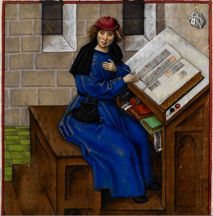
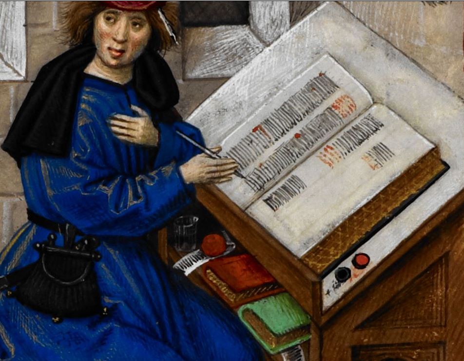
This illustration shows the author of Roman de la Rose pausing a moment in his work. Lots of manuscripts have a picture of the scribe or compiler of the volume at hand creating it and presenting it to a patron, generally as one of the first few illustrations in the book. This one is different; it’s about three-quarters of the way through the book, a part of the story itself. That suggests he’s probably the original composer of the text itself, possibly Guillaume de Lorris, breaking the fourth wall here.
Even without a caption, the picture itself hints that this must be the original creator, not a copyist or compiler or redactor or glossator. (There’s probably some artistic license at play, so this may not represent how medieval authors actually worked.) He’s writing in neat columns with red symbols and titles giving structure to the piece, and has even left a squarish space for a miniature illustration, like a scribe might do in a presentation copy for a patron or buyer, but not in a composition from scratch. However, something very important is not in this picture. There’s only one open book in sight! He can’t be making a copy of an existing exemplar or draft. I don’t know if scribes ever created copies of works they had memorized, but in this case the text clarifies that he’s the author.
Anyway, note that the large folio tome he’s writing in has gauffered edges. Folio describes a book where the pages are created from sheets of parchment folded once; the book size from sheets folded twice is called quarto, which is what the two volumes in his writing desk are. It’s harder to see, but those both also have patterns on their edges, meaning that (as far as we can tell) all of his books are gauffered– quite the fancy collection! The book he’s writing in is actually so big I’d guess it’s Royal or Imperial folio, since the height of the book looks longer than his forearm. It’s hard to be certain, but I think it’s much bigger than my next example.


The King of Arms of the Order of the Golden Fleece is not as fancy, book-wise, although he is also composing his text in a gauffered folio book. His writing desk is not designed for facing against a wall, which might mean it’s intended for non-solitary use, but I don’t know a lot about writing furniture. This design also means the storage area can be on the tall side, and accessed without interrupting his work or banging his shins with a cabinet door.
Peek inside that cabinet. It appears to be divided by a single shelf, with books stored rather haphazardly above and below. To the modern eye, it may seem more haphazard than the artist intended, since we’re used to books being packed vertically onto shelves with their spines facing out. Take a look at Erik Kwakkel’s post about reference book furniture to see more images of medieval reading and writing rooms with lots of books in them– not a single one has books on a shelf in a case or cabinet, all vertical with their spines facing out.

In the medieval period and into the early modern period, it was unusual for any person or institution to have so many books that they needed to be stored efficiently and in a way that would facilitate finding exactly the one you wanted. Even if you have dozens of books, you would probably recognize them all by their bindings (since matching bindings were also rare!) and picking up and checking each one wouldn’t be that much bother. If you needed to add a label to a book, the page block is a much easier surface to write on than the spine or cover, so you might write your label there and store the book with that edge facing out.
Anyway, I’m getting off track again. The King of Arms of the Order of the Golden Fleece has eight books in addition to the one he’s writing in, mostly stored in a cabinet on the back of his writing desk. Some of them are gilded, but I think none of the closed books are gauffered.
Let us continue, then, to a man who is only shown with five books, but of those, the two biggest ones are gauffered, another has solid-color decorated edges, and two (the ones not lying flat) are labeled on their top edge. Like the others, I’ve included a detail zoom, and since I couldn’t find a photo that showed it better, a color-adjusted version of the detail to draw out the gauffering design a bit.

Nearly all of the books are closed with pairs of metal clasps, except the smallest one which has a binding that wraps all the way around and overlaps, then closes with red ribbon ties that have metal caps. You can also see clearly on two of the books (the closed gauffered one and the one with blue edges) that their covers have metal ornaments, although these in particular are not very ornamental– they all look like flat discs with raised flat discs in the center. These protect the covers from getting worn by rubbing against the surface of whatever book stand they’re read or displayed on. This book furniture is another thing that isn’t possible in collections with lots of books; books with raised metal parts interact awkwardly with each other.


This is Saint Paul, and like many saints, he’s posed here with the object of his martyring: a sword. However, there’s something unusual about this sword (especially as a symbol of martyrdom!)– look closely at the edge, visible just above his left wrist, and you’ll see it seems kind of square, not at all like a cutting edge. The Master of the Parrot has painted Saint Paul writing with not just any sword tucked into his arm; that’s a federschwert, a fencing (rather than war) sword with squarish edges that can withstand a lot of use but can’t be sharpened to cut, and his has an especially fancy grip.
The next few images are paintings of female saints. They’re shown holding books as symbols of their education and studious nature. As you look at these, take note of how they’re holding and using the books. In the modern study of medieval books, we can sometimes guess how a book might have been used by its size, or where the most fingerprints or smudges are.

Saint Auta was one of the companions of Saint Ursula, whose legend tells of the eleven virgins she traveled with (or eleven thousand, depending who you ask). In this altarpiece panel, Auta, still punctured by the arrow of her martyring, with a saintly palm frond tucked between her fingers, holds the viewer’s attention in the foreground, seemingly unaware that her relics are being transported behind her with great ceremony.


Auta’s book looks quarto-size, with edges gauffered in a fine, repeating pattern. It has a chemise binding, but not quite like the ones in the paintings of Mary Magdalen or the Virgin Mary above. Auta’s is trimmed much closer around two edges of the book, but left very long on the third, suggesting that it’s actually a large girdle book. Girdle books had a long extension of their covering material which allowed them to be hung from a belt (or girdle) for hands-free transport. Quarto seems big for carrying on a belt, to me (imagine hanging a modern hardcover novel from your belt) and I would prefer the next smaller size, octavo, which is closer to paperback size, but then, I need different things from books than medieval readers did.


Saint Margaret of Antioch is wrestling with a gauffered folio volume here. I’m impressed; I don’t think I could hold a folio book like this and still have the parchment pop up. The snout at the bottom suggests Margaret is managing this with a smallish dragon underfoot. One of her miracles was surviving being swallowed by a dragon, and freeing herself by inflicting her faith upon it from the inside.
Because she exited an abdomen unharmed, one of her saintly specialties is protecting or interceding on behalf of women in labor. Some depictions of her show the dragon holding receiving blankets in its mouth, although this often looks more like she’s found a way to deal with her dragon’s uncontrollable drooling problem. Margaret is also one of the saints who spoke to Joan of Arc (probably sans dragon drool).
Margaret’s book has hinged metal clasps– you can see the clasp dangling from the far edge, and the metal piece it connects to protruding on the near edge. These smooth, square clasps are reminiscent of the ones on Saint Paul’s books. The top end of the spine looks interesting, but I couldn’t find a better resolution image that revealed what the little gold flower shape is.


Looking for a bigger photo of the Phoenix Saint Margaret is how I found this lovely triptych, also by Jacob Corneliusz von Oostsanen. Like the Annunciation at the Met, the wings of this triptych are attached with hinges so they can be closed across the center panel like shutters. The format creates a natural hierarchy of significance, with the center image of Mary and Jesus twice as large as the scenes with saints to either side. These particular saints were a popular combination, so much that the Wikipedia page about triptychs has another example with the same composition and subjects, including a gauffered book with an ornament at the top of the spine.
Saint Catherine of Alexandria (on the left with the sword and wheel) and Saint Barbara (on the right with the castle tower) are among the “Fourteen Holy Helpers,” the most effective saints to pray to in adversity, as well as virgin martyrs associated with self-education. I think they are great role models for daughters, but Barbara is known primarily for defying her father and Catherine’s big skill was winning debates against opponents twice her age. I suspect many parents might prefer the quiet behavior shown in the painting.
Catherine is reading a book with zig-zag gauffering, a single metal clasp, and a large gold and pearl ornament at the top of the spine (maybe a much blingier version of the feature on Margaret’s book?) which also anchors a thin bookmark with a gold tassel at the bottom. Barbara’s book has nested arch shapes in the gauffering, a large gold clasp, and appears to have a gold-stamped cover, providing an extra touch of richness– bindings were most often blind-stamped, tooled with no ink or foil.
I didn’t know it at the time, but the first manuscript I transcribed and translated from was a heckin’ chonker of a two-volume gauffered set. I don’t have any photos with other objects for reference, but the cover measurement on these is 402 mm x 276 mm, nearly 16 x 11 inches.
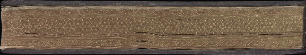
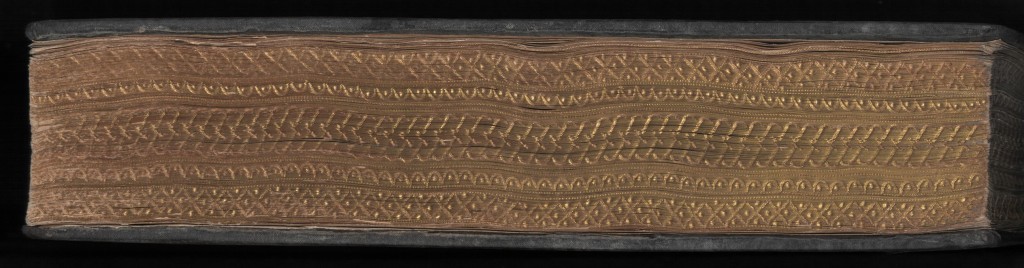
This is Paulus Hector Mair’s Opus Amplissimum de Arte Athletica, the copy that is held in Vienna. It’s on paper, not parchment, so it doesn’t need clasps, though the paper has picked up a bit of a warp. It’s interesting that the edge decorations use different designs– maybe the pattern-rollers were very width specific? If you look at the corners, you can see a little wear, especially on the second volume (the thicker one), but all in all, the fancy decoration is in great shape for being well over 400 years old.
The heckin’ chonker size is important, although it’s hard to keep in mind when I’m reading the book as high-res scans. There are a lot of things we don’t know about combat manuscripts, but how they were used (or intended to be used) is a really big one. The size and shape of books can be a hint, either because they match a specific size with a known use, or because their size or shape renders some uses impossible. Look at the books in these paintings, and their sizes, and how people are interacting with them. Then imagine going to sword class with a book like Saint Margaret’s. In a very literal way, where does a book like that fit in class? How would you use Mair’s two-volume set?
I’ve strayed a long way from my plan to show you some pictures of gauffered books, though I guess that won’t surprise you much if you’ve been following my writing. Loosely controlled straying is how I get from “What did medieval people do?” to “How did they do it?” to “Why did they do it that way?” The answers are rarely what I expect– when I find answers– but that’s how I know I’m on the right track. If my expectations aren’t being challenged, am I even learning anything?
I don’t tend to write about the kind of profound stuff that might rock your world, but I hope going on these rambles with me shakes up your expectations occasionally!

The color of the girdle binding on Auta’s book looks similar to the fabric covering her relics. Are the patterns similar as well?
LikeLike
I fixed it so you can click through all of the pictures to see bigger versions! Sorry about that.
I think the cloth on the book is shot silk or maybe a subtle moire, while the altar cloth has a large complex pattern (probably woven?), so to my eye any similarity is just about the particular shade of gold, but I’m not an expert on divining fiber arts in paintings.
More info (in Portuguese) about the whole altarpiece that panel is from: https://pt.wikipedia.org/wiki/Ret%C3%A1bulo_de_Santa_Auta
LikeLike
[…] (Kendra also talks about a recent article on medieval book edges. You can find it here.) […]
LikeLike
[…] the upper left corner of the manuscript. You can read more about why book snakes are necessary in my previous post, but in brief, they hold pages in place while minimizing handling, reducing contamination from […]
LikeLike
[…] Last time, I noticed that in a couple of my examples, the books in paintings had a fancy ornament at the top of the spine. With some new examples and some research, I now believe those ornaments are fancy versions of multi-stranded bookmarks. […]
LikeLike
I would think that that sort of large book might be sort of a lecture aid at times?
LikeLike
Hit send to early: I meant that the illustrations and such are large engouh that it would be reasonable for several people to be looking at it at once, by way of a study guide.
LikeLike
[…] I run into Catherine a lot when I’m on an art gathering binge, because she’s maybe the most common medieval motif of a lady with a sword, and seems to just generally have been a very popular saint. I’ve written a little about her previously, in my post about gauffered books. […]
LikeLike